Using Data for Continuous Improvement with the New and Improved NYKids Performance Tracker Tool
By Maria I. Khan and Kristen C. Wilcox
“We cannot improve at scale what we cannot measure.”
– Carnegie Foundation for the Advancement of Teaching
Collecting, interpreting, and using data is necessary for knowing what changes worked, for whom they worked, and under what circumstances they worked. Without data and the opportunity to make sense of what evidence is provided by the data, we might struggle to grasp what needs to be changed or for whom.
In this blog we discuss the growing attention to data-informed continuous improvement approaches and offer an overview of the new and improved NYKids Performance Tracker tool that can help users interpret data to inform their improvement efforts.
Data Use in Continuous Improvement
Educators, policymakers, parents, and community members often wonder how schools of interest to them perform compared to other schools. Any of these stakeholders may also wonder how they can grasp changes in student performance over time, in different content areas, and by different subgroup characteristics.
As just one example of efforts to encourage the use of data for continuous improvement, the New York State Education Department (NYSED) recently established an improvement planning process for all New York State schools. NYSED’s process encourages the collection and use of data as educators “envision, analyze, and listen” to inform their improvement initiatives.
NYKids Performance Tracker
One resource to assist those interested in the educational experiences of young people in New York State is the NYKids Performance Tracker tool. Providing tools such as the Performance Tracker to support continuous improvement has been central to NYKids’ work since 2004. Early in NYKids’ development, our team partnered with specialists at Wiser Trade to develop this unique resource, which has been recently updated to make it more user-friendly. The new and improved Performance Tracker can help users answer questions like:
- How do students in different subgroups (students with disabilities, ethnic and linguistic minorities, genders, etc.) compare in performance to students in those same subgroups in other schools?
- How does one school’s performance trend change over time compared to other schools?
- How can we compare student performance in schools serving different sub-populations of students (e.g., such as the level of socioeconomic disadvantage or linguistic background)?
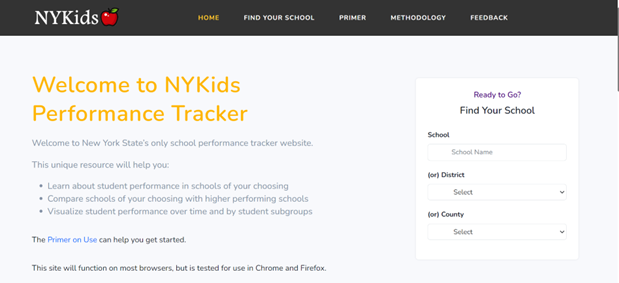
The NYKids Performance Tracker allows you to answer these questions and more. The first step is to select a school you want to compare. You can make a school selection by entering the school’s name or beginning your search by using the district or county information at our Performance Tracker site. You also have three comparison options here (please visit our methodology page for details):
- Comparable schools are autogenerated including New York City
- Comparable schools are autogenerated excluding New York City
- Comparable schools are selected by you
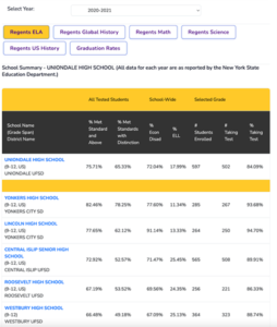 If you want to see how your chosen school compares to other top comparable schools based on demographic criteria and student performance outcomes use the main chart :
The main chart presents student performance comparisons between the selected school and comparable schools. As you scroll down, you can view averages of top comparable schools, opportunity gaps, comparative advantages/disadvantages, and the number of schools in the total comparable pool.
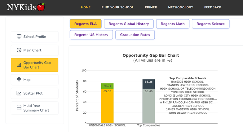
- If you want to graphically visualize opportunity gaps between the selected schools and comparable schools, use the opportunity gap chart:
The first graph presents the overall data for the percentage of students who met the standard and above and those who met with distinction for the selected school and the top comparables.
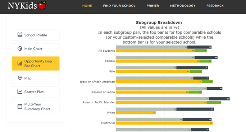
The second chart presents this information by subgroup breakdown using students’ background information.
- If you want to compare the selected school to other schools in the state and in relation to economic disadvantage and percentage of English Language Learners, use our scatter plot:
Note that the scatter plot tool is interactive. We invite you to have fun with it using your mouse or keypad!
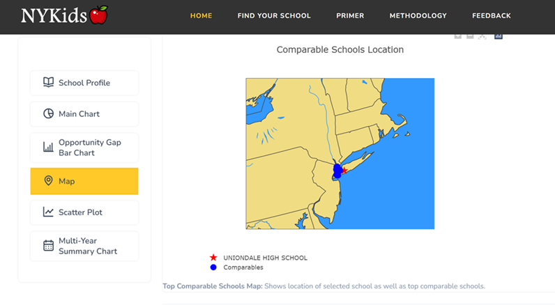
- If you want to view the geographic location of a school of your choice and comparable schools, use our map tool:
Here you can view the geographic location of your chosen school as well as the locations of top comparable schools throughout the state.
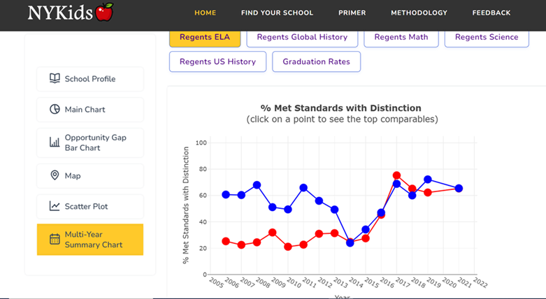
- If you want to comparatively assess student performance trends over time between your selected school and comparable schools, use our multiyear summary chart:
This chart shows your chosen school’s student performance over time alongside the average of top ten comparable schools for the same time period.
As a final note, we, here at NYKids recognize the limitations in using the state test scores and graduation rates as the only measures of student experiences in our schools. Yet, we do hope that user-friendly databases like the Performance Tracker can help users see where opportunity gaps exist so they can target their improvement efforts.
We invite you to view this new primer to get started and reach out to us at nykids@albany.edu if you would like a personalized demo with one of our staff.

