A Primer for Using the NYKids Know Your Schools Performance Tracker
A nagging question for many school and district leaders as well as others in charge of tracking student performance is “How do our kids perform compared to those in other schools?” Collecting and interpreting data to answer that question can be arduous and many of the existing databases don’t answer a number of other more fine-grained questions like:
“How do our students with disabilities, ethnic and linguistic subgroups, boys and girls, etc. compare in performance to those in other schools?”
“How do our students’ performance trends over time compare to other schools?
“How do we get a fair and helpful comparison to other schools taking into account similar poverty levels, similar English language learner percentages, or by geographic location or urbanicity?”
The NYKids Know Your Schools database has been in existence for over ten years and was developed in a collaboration between NYKids and specialists at Wiser Trade to help answer these questions among others.
Main Database Features
The database’s main features include:
- School profile (showing demographic data about a school)
- Main chart (showing student performance comparisons between a chosen school and other comparison schools)
- Opportunity gap chart (showing disaggregated student performance data by subgroup and in comparison to other schools)
- Map (showing a chosen school and comparison schools on a map of New York State [NYS])
- Scatter plot (showing a chosen school in comparison to other schools in the state and in relation to poverty and percentage of English language learners)
- Multi-year summary chart (showing student performance comparisons between a chosen school and comparison schools over time)
In this blog (part of an upcoming series on the performance tracker database) we focus on one of the more popular tools: The scatter plot. Scatter plots are used when you want to show the relationship between important characteristics like student performance and qualities of the student population served.
How to Get Started
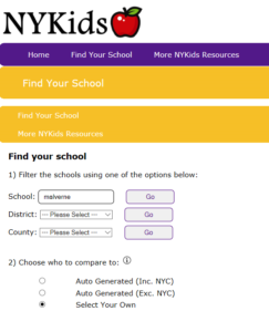
When you arrive at the Know Your Schools database home page you will see three options to begin your search:
- School
- District
- County
You will also see three comparison options:
- Auto generated (including New York City [NYC])
- Auto generated (excluding NYC)
- Select your own (The select your own option will prompt you with the same three search options: school, district, or county and its here that you can make some choices based on your own knowledge of and interest in other schools.)

What the Scatter Plot Does
The scatter plot displays student outcomes by family income and student language background (i.e. English language learners). These two characteristics are highly correlated with school outcomes and, therefore, important considerations when making comparisons.
The scatter plot tool is interactive in that you can mouse over any of the dots (representing schools in New York State). As an example of how to use the tool and interpret what you see, we chose to focus on one of the odds-beating schools in NYKids latest study, Malverne High School in Nassau County.
Malverne was chosen for the latest NYKids study because of its above-predicted graduation rates (both Regents and Advanced Regents) among Black/African-American, Hispanic/Latinx, English language learners, and economically disadvantaged students over time.
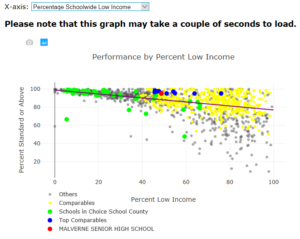
In Figure 1, we take a closer look at Malverne’s ELA scores. Malverne High School’s percentage of students meeting or exceeding standards on the NYS Regents ELA Exam by percentage receiving free or reduced price lunch (i.e. low income) is indicated with the red dot.

Figure 1 can also be plotted replacing low income with the percentage of English language learners (ELLs). Figure 1 also shows the scatter plot trend line. This is the average score for schools as income changes and Malverne is indicated as above this trend line.
In addition to showing Malverne (the chosen school) as the red dot, Figure 1 shows:
- Gray for schools not in NYC (one of the three comparison options)
- Yellow for ‘comparables’— those schools both not in NYC and not selected as top comparable schools based on family income and percentages of ELLs served.
- Green for schools in the county of the chosen school
- Blue for schools not in NYC, and selected as top comparable schools— these are schools that serve students who are equally or more disadvantaged, yet exceed the chosen school’s performance.
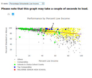
Figure 2 takes the analysis a few steps further. First, schools like that which we have arbitrarily labeled school A (in the same county as Malverne), produced results (at least in terms of ELA scores in 2017) below that of schools with more students qualifying for free or reduced price lunch (i.e. low income) such as Malverne. Second, even for odds-beater Malverne, there is room for inspiration shown in the plot. School B, for example, serves higher percentages of low income students with slightly better ELA scores.

It is important to note that state test scores and graduation rates tell only a piece of the school’s story. These metrics are inevitably limited in what they can tell us about how kids are developing into well-rounded, academically prepared, and emotionally and socially healthy people. They also tell us little about the many things professionals in schools do to contribute to their communities including partnering with families and private and public sector agencies.
Nevertheless, the scatter plot can be a powerful tool to answer some of the questions posed above, help set student performance targets, and find other schools to reach out to get insight into promising practices.
We invite you to delve into the scatter plot and consider: If others can achieve better outcomes than we have achieved – then we can too!
For great ideas on how to improve student performance in your chosen school…
- Check out what odds beaters like Malverne have done to consistently perform above the trend lines in the NYKids case study.
- Search for other schools of interest to you in the NYKids Research Results page where dozens of case studies delve into the nitty gritty of how educators across NYS have improved their schools and student outcomes.
- Get direct assistance from NYKids and our partners (CASDA and BOCES) for help with using the suite of NYKids improvement resources.
